Live Oak Bank Acorn Design System
Lead Product Designer building Live Oak Bank's comprehensive design system - a scalable component library ensuring consistency, accessibility, and efficiency across all digital banking products.
Enterprise Design System
2022-2026
Lead Product Designer – Design Systems
Live Oak Bank
The Challenge
Live Oak Bank's digital products were built with inconsistent patterns, duplicated components, and varying design implementations across teams. This led to inefficiencies in development, accessibility gaps, and a fragmented user experience across the banking platform.
Objectives
- Create a unified component library that scales across all Live Oak Bank digital products
- Establish design tokens for consistent color, typography, spacing, and elevation
- Build accessible components meeting WCAG 2.1 AA standards
- Develop comprehensive documentation enabling self-service adoption by product teams
- Reduce design-to-development handoff friction and accelerate feature delivery
My Responsibilities
- System Architecture: Defined component hierarchy, naming conventions, and organizational structure
- Component Design: Created foundational and complex components including Account Cards, form elements, navigation patterns, and data visualization
- Design Tokens: Established semantic token system for theming and brand consistency
- Documentation: Built interactive demos, usage guidelines, and implementation specifications
- Governance: Developed contribution guidelines and component lifecycle processes
The Solution
Acorn 1.0 is a comprehensive design system built in Figma with full component variants, interactive states, and detailed documentation. The system includes foundational elements (typography, color, spacing, elevation), form components, data display patterns, and complex banking-specific components like Account Cards with pending states, alerts, and transaction displays.
Project Gallery
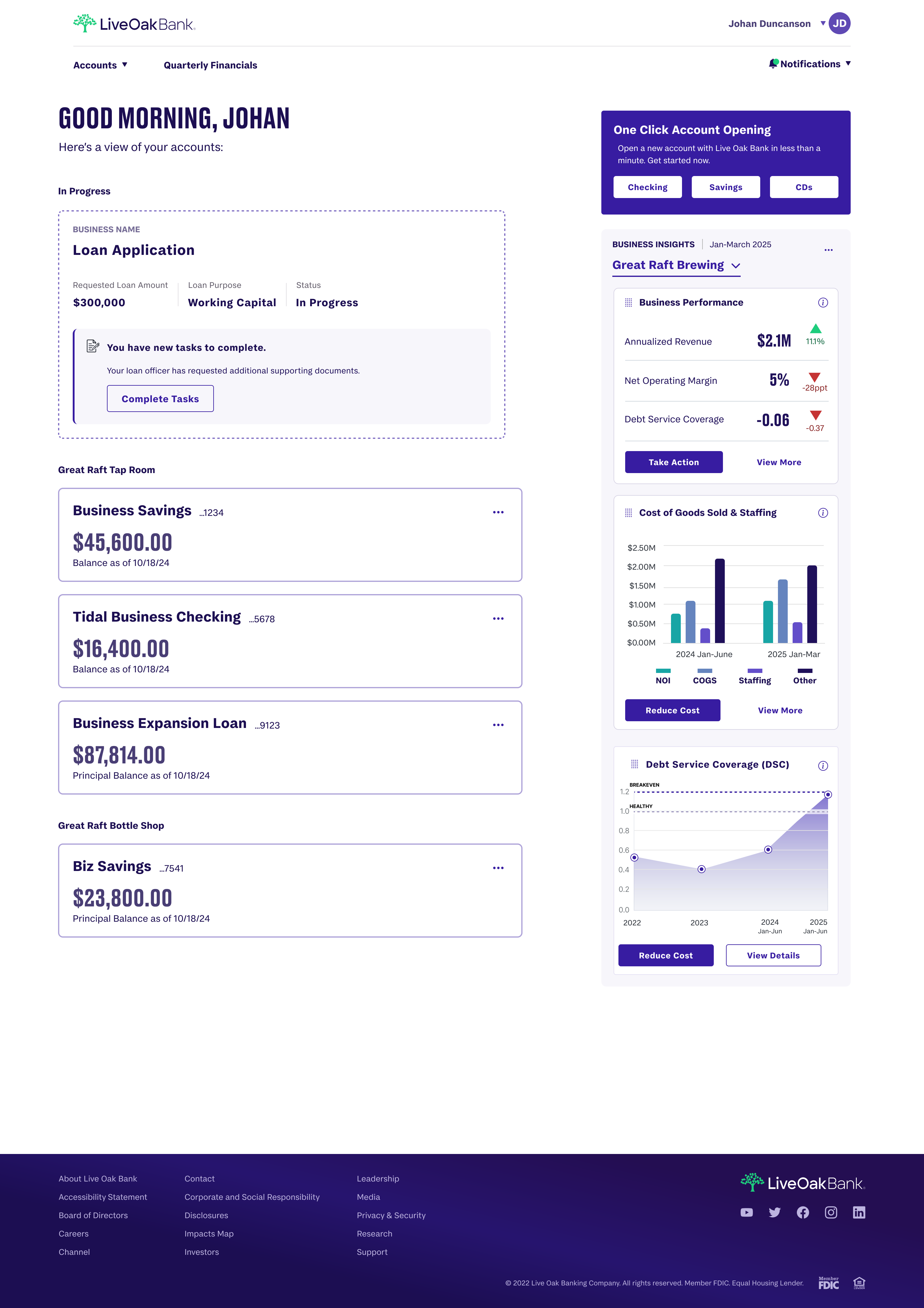
Vision 2025 Dashboard - Acorn components in action showing account overview, loan applications, business insights, and data visualization
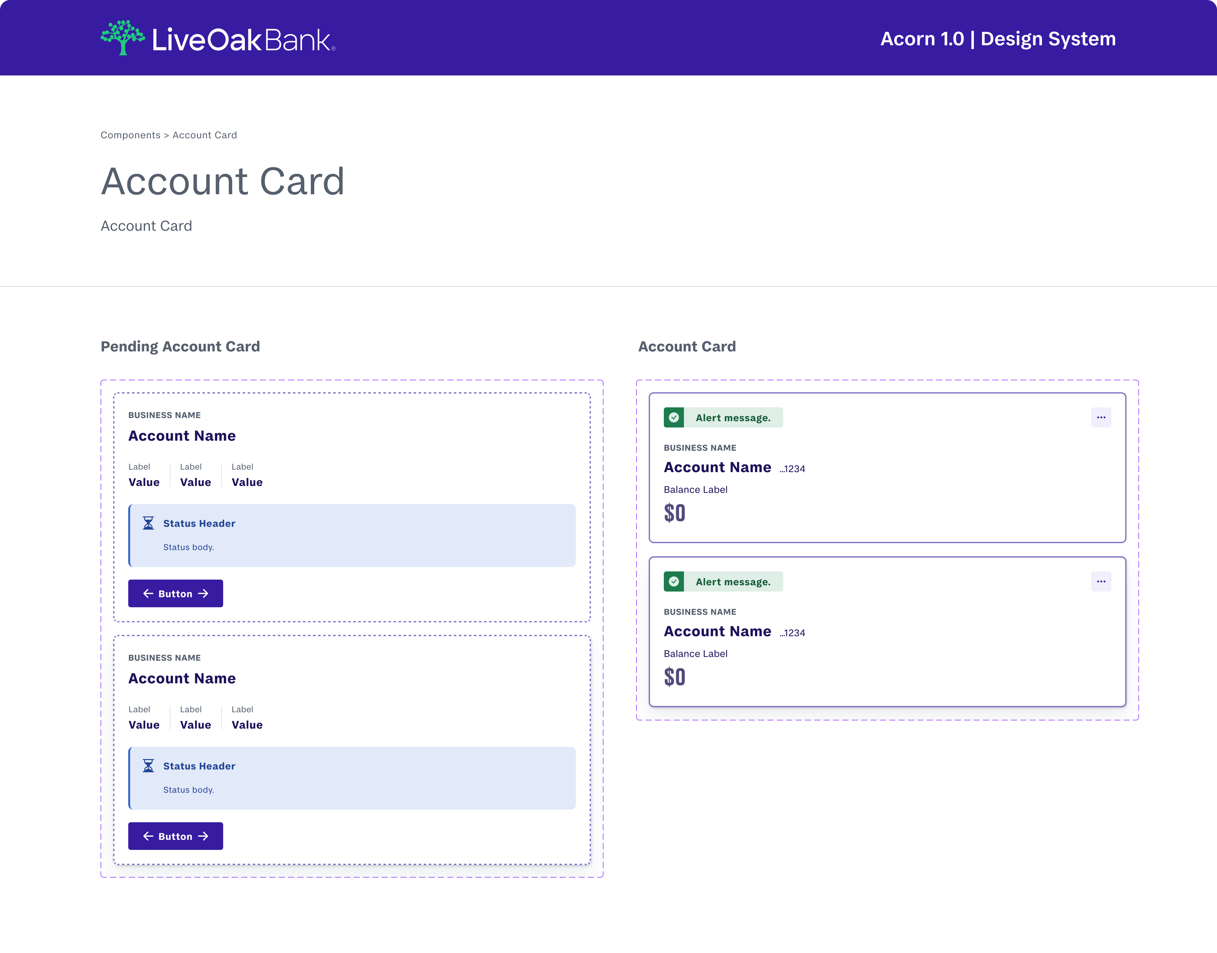
Account Card component documentation - Pending Account Card and Account Card variants with status indicators and interactive states
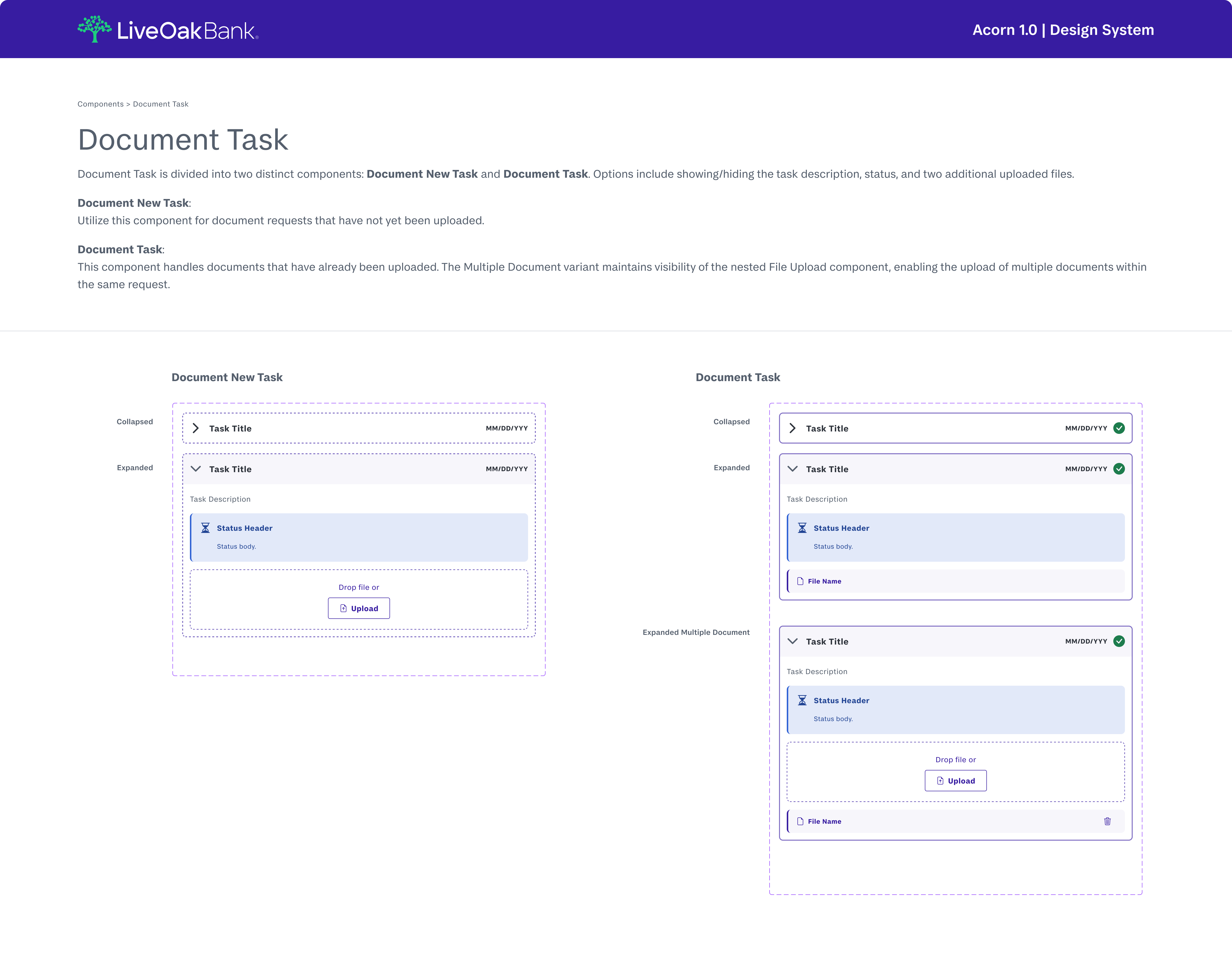
Document Task component - Collapsed and expanded states for Document New Task and Document Task variants with file upload functionality
Results & Impact
- Launched Acorn 1.0 with 50+ production-ready components
- Reduced design inconsistencies across 5 product teams
- Accelerated feature design cycles by providing reusable, documented patterns
- Improved accessibility compliance with built-in WCAG 2.1 AA standards
- Established single source of truth for Live Oak Bank's digital product design
Key Takeaway
Building a design system for a financial institution requires balancing consistency with flexibility. Acorn demonstrates how thoughtful system architecture enables teams to move faster while maintaining the trust and professionalism essential to banking experiences.